
XCEED
Research & Strategy
Full Identity Design
Web Design & Development
Copywriting & Messaging
Connecting teams to dreams.
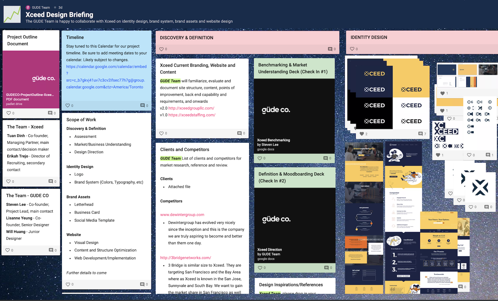
The güde folks at Xceed Group LLC, formerly known as Xceed Staffing, reached out to us for a brand refresh and website to expand their market and propel their business to the next chapter. In the business for 10 years, and having worked with other consultants for the past two years, through our discussions, Xceed was ready to invest in an uncompromised project and timeless brand.
As a staffing agency, they primarily connect up and coming and senior finance and admin candidates with tech clients and hiring managers in the Silicon Valley Bay Area. In our discovery, through detailed market and competitive research and interviews with existing clients, we collaboratively envisioned a new brand that would present a tech-saavy, bright and passionate presence, while maintaining a corporate professionalism that strikes the balance for their target market. We reworked the messaging and copy to better resonate with their community and express their values as a relationship driven and closely collaborative team.
Each element was carefully and thoughtfully chosen, through many iterations and testing, from the conceptual and symbolic meaning of the logomark, to the sophisticated balance of the typefaces, to the dynamic power of the colours, reasoning and guidelines clearly expressed in the detailed brand system.
We absolutely loved collaborating with the folks at Xceed Group, and the whole process was an exciting and wonderful time. We were honoured to take on this project and the opportunity to not only design but partner together, and to learn from one another.
A people agency needs a people-first approach.
Both of our teams agreed the original branding and website design required a fresh rebuild. The design and content was impersonal, generic, disorganized, and lacked understanding of their clientele, losing brand effectiveness and trust as a result.
We saw this as a fantastic opportunity, not only to help our clients, but as a chance to pass on knowledge about brand strategy and design. Through a detailed guided process of research, benchmarking, and consultation, our clients were educated on brand archetypes, psychology of design, function of logos, the anatomy of a marketing funnel, and more. As always, in each of our projects, we aspire to lift our clients up and set them up for future success.
To further our understanding of the market, we developed detailed personas, and researched our clients' customers. Some of these clients included Glu Mobile, a game studio, SaaS businesses like Qualys, music distribution and radio platforms like Sirius XM and Pandora, and cutting edge AI and AR technologies like Ambarella.

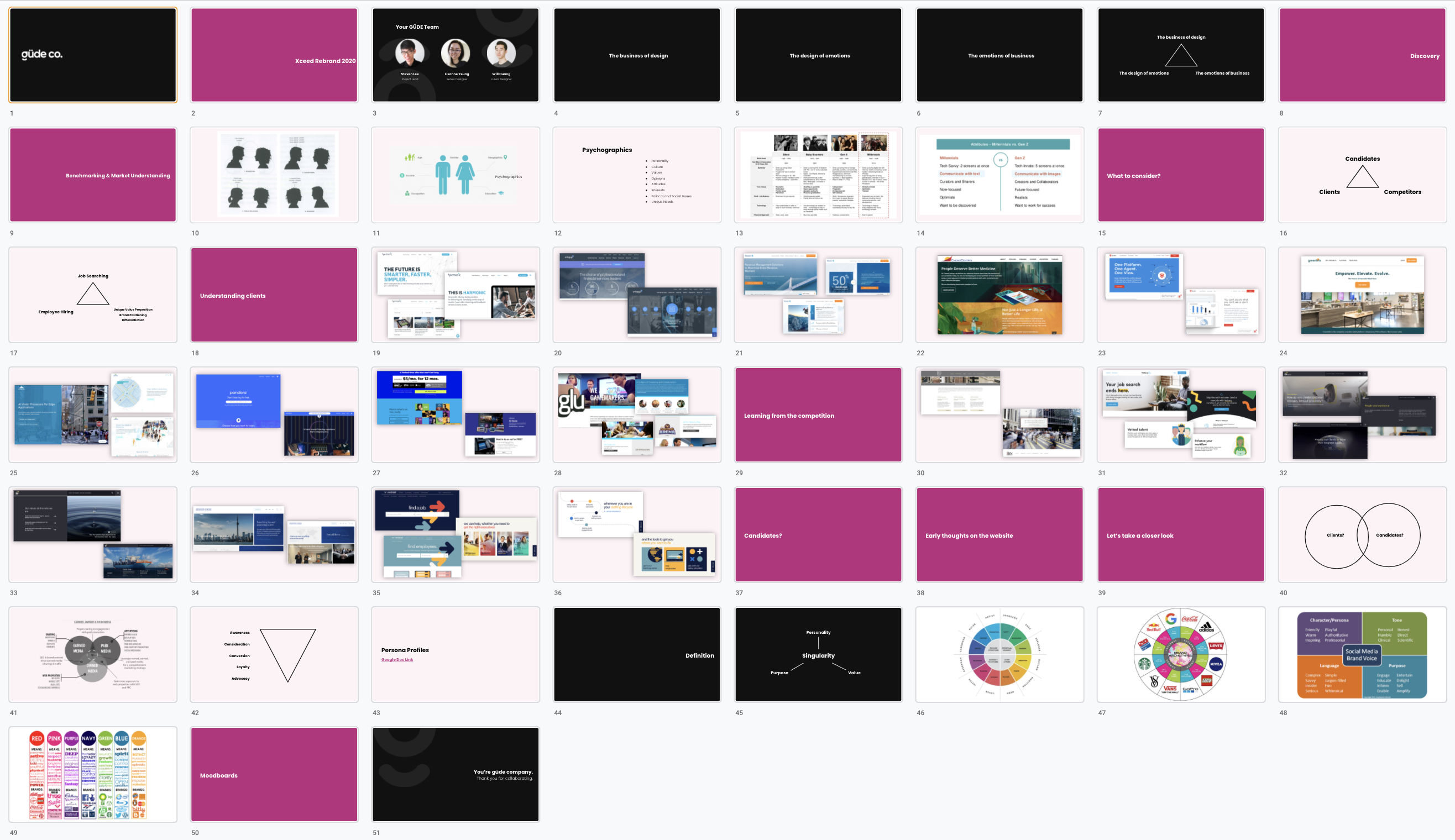
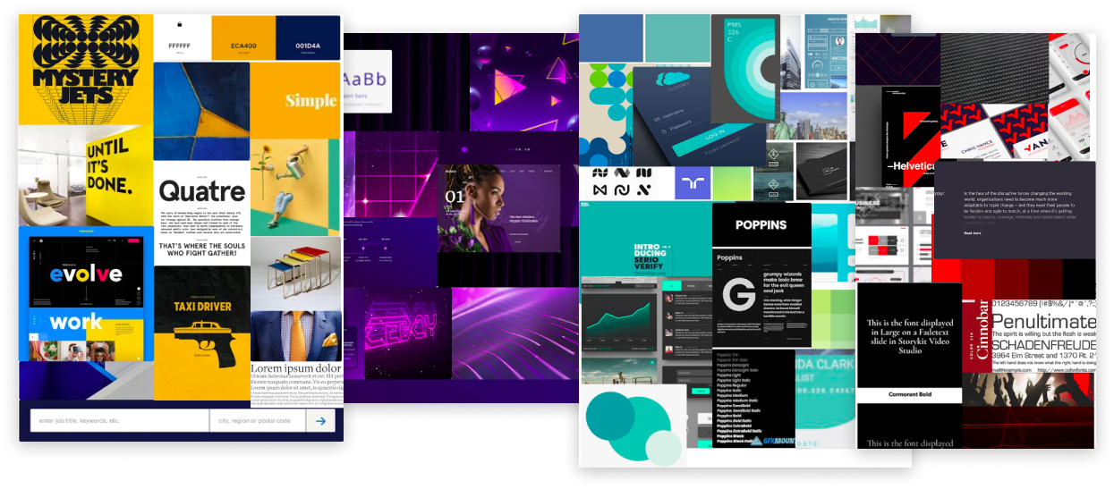
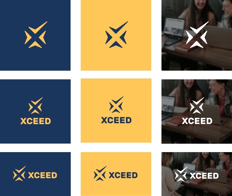
After a thorough research and consulting process, our team developed moodboards to approximate a design direction, and our color palette was carefully selected for digital and print applications with matching correspondence across RGB, CMYK, and Pantone. Based around the primary yellow and blue theme, we intended to bridge the gap between a fun, progressive, tech-saavy and electric vision, and a grounded, mature, sophisticated and business aesthetic, with consideration for our mission and our clientele. In conjunction, we developed logo concepts and sketches, and arrived at preliminary logos in collaboration with our client's preferences in mind that we tested among professional and personal networks, acquiring 78 responses. Feedback confirmed our assumptions, and allowed us to further advise against preferred choices for the purpose of readability. Through many iterations and considerations, we arrived at our final solution, incorporating the elements much loved by our wider community but also prioritizing functionality.
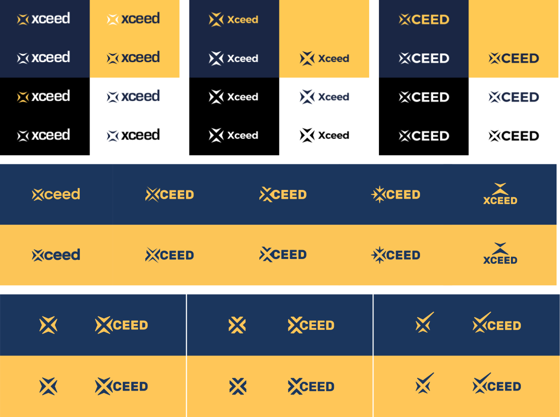
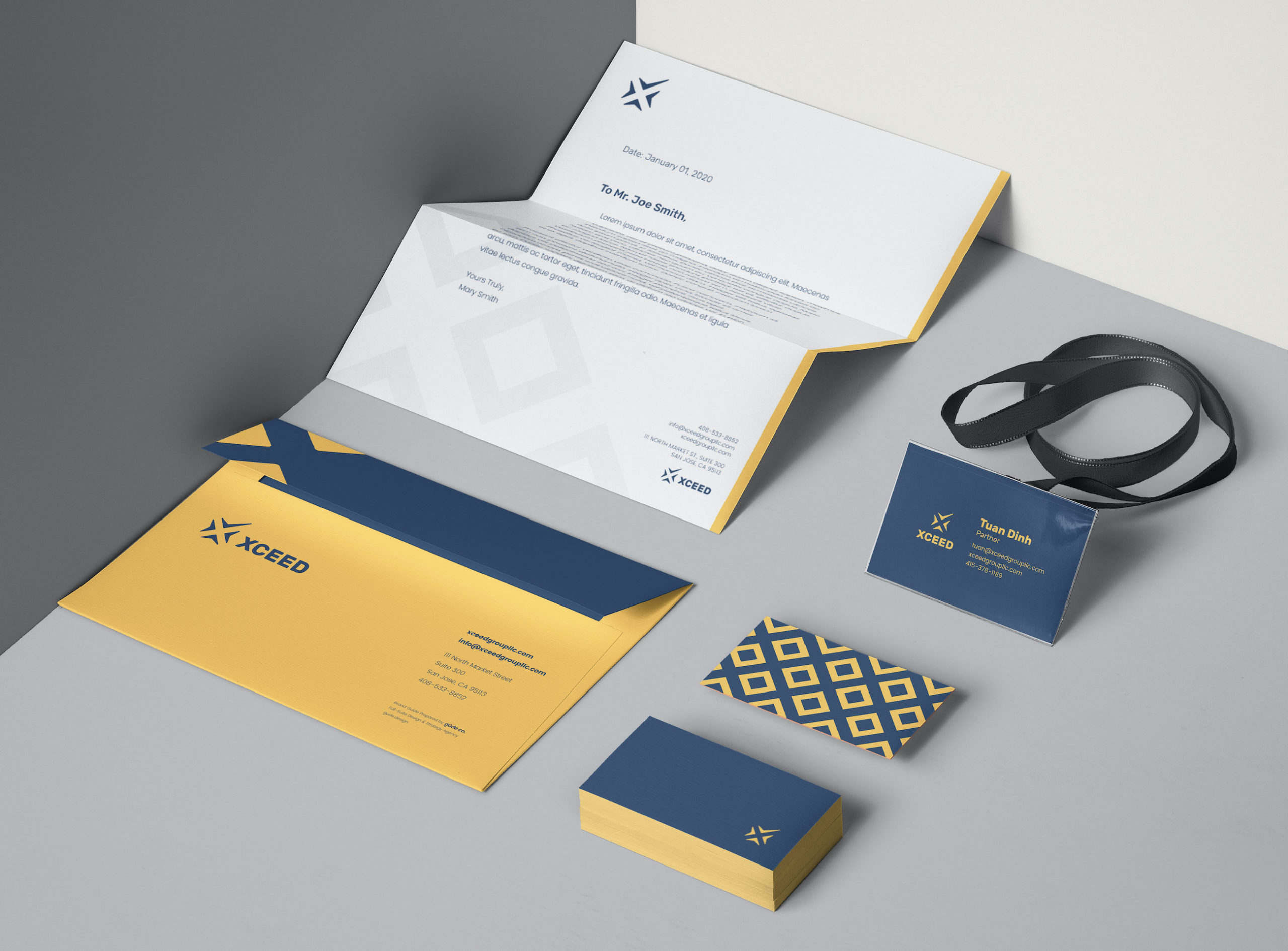
The iconic logomark was developed with important considerations such as simplicity for scalability, versatility for layout and application options, easy recognizability and meaning.
The logomark represents:
- The X in Xceed
- Point of convergence, intersection, connection
- Direction by the four cardinal compass rose
- Checkmark and graph of success and growth


A corporate identity and brand system is a keystone to any business. Every element is designed with intentional decisions according to detailed and lengthy ideation, research, consideration, reasoning, and understanding. We developed a full brand guide and system to ensure Xceed has the building blocks to a cohesive, timeless, functional, versatile, memorable and iconic brand that captures what our client does and who they work with.
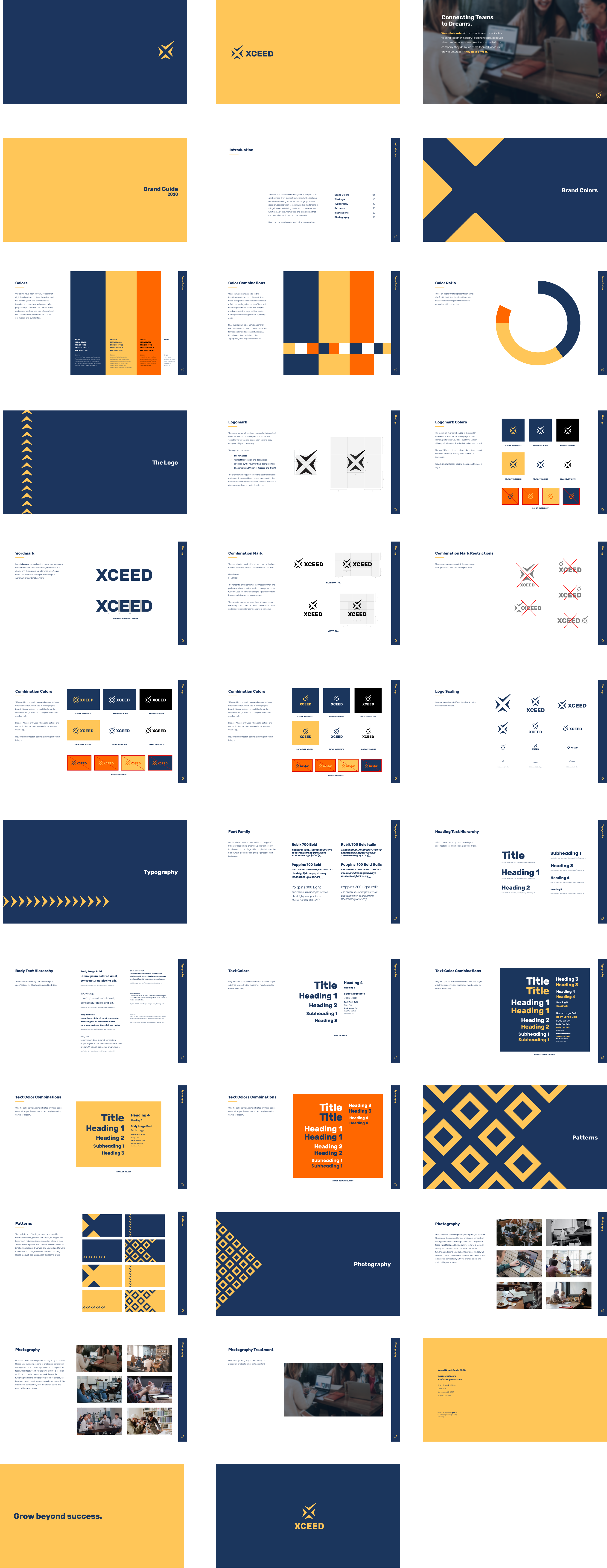
As part of our engagement with Xceed Group, our full branding package includes stationery and corporate identity assets such as business cards and letterheads.
Our copywriting, website design and development section of the case study is under construction. Stay tuned.